
Advertising over the last 100 years has developed literally into an art form. An art form that takes into account effective slogans, persuasive statements and color manipulation. You only need to look to some of the larger companies seen in the Riverside, CA. area to see this art form and practice. One area that is very effective but often overlooked by small businesses is the psychology of colors. Colors have the ability to cause the mind to think and view products, services and conditions differently. In some cases creating a spontaneous action as a results of the color that is seen. In this article we are going to address the psychology of colors and how it relates to advertising for your small business in Riverside, CA.
Red means Stop, Green means Go
Colors are around us in our everyday life. They can even help us make choices such as seeing a red stop sign or stop light means to… (wait for it) … Stop. When recognizing that colors can help grab someone’s attention or to even help place someone in a certain mood; it will help your sign, vehicle wrap or even business card be more effective based upon its purpose.
Pastels vs. Primary Colors
The use of colors in your advertising project can help identify the purpose of the ad.
Primary colors are generally used to help grab someone’s attention. Colors red and yellow bring about a level of awareness while blue and green establish a sense of clarity and instruction. When studied at universities and medical centers, report show that when candidates were shown different colors that physical changes took place. Red and yellow for example, would raise the blood pressure; in some cases even cause the candidate to perspire from a sense of anticipation. The mind and body were seem to react to these primary colors by placing the candidate in a reactionary mode.
Pastel colors are used in areas where considerations are made. Utilize colors such as these when you want someone to ponder or think about the information that’s being provided. Informational flyers are great examples for the use of pastel colors. Softer tones like pastels can bring about softer responses; these colors also can be made to stand out in a comparative sense against darker colors, allowing the recipient to be brought aware of the circumstance without invoking a physical response.
Call Precision Sign and Graphics today for Stunning Graphics at an affordable price! (951) 332-2700
 Blue is for Boys and Pink is for Girls
These colors for years have been used to identify products and services based upon gender. There is no psychological equivalent to the use of these colors in its origin but rather identified through societal shifts. According to the Smithsonian:
“A June 1918 article from the trade publication Earnshaw’s Infants’ Department said, “The generally accepted rule is pink for the boys, and blue for the girls. The reason is that pink, being a more decided and stronger color, is more suitable for the boy, while blue, which is more delicate and dainty, is prettier for the girl.” Other sources said blue was flattering for blonds, pink for brunettes; or blue was for blue-eyed babies, pink for brown-eyed babies, according to Paoletti.
In 1927, Time magazine printed a chart showing sex-appropriate colors for girls and boys according to leading U.S. stores. In Boston, Filene’s told parents to dress boys in pink. So did Best & Co. in New York City, Halle’s in Cleveland and Marshall Field in Chicago.
Today’s color dictate wasn’t established until the 1940s, as a result of Americans’ preferences as interpreted by manufacturers and retailers.”
Lean on the Experts
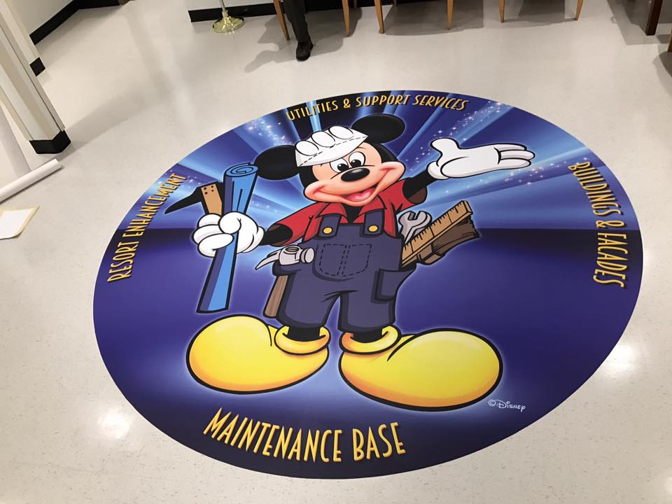
Because of this fast-paced internet culture that we live in today, many small businesses take to the internet to get quick products at a cheap price without taking into account the effectiveness of the design of the product. By carefully analyzing the design of your sign, vehicle wrap, banner, floor graphics, wall graphic or business card you can make each transaction more productive. The experts at Precision sign and graphics serving the Riverside, CA. area have been in the advertising game for years. Our qualified design artists will take into consideration the purpose of the product rather than just the aesthetics of the design. This forward thinking approach will allow each of the products that we provide to help give you the response that you’re looking for.
Useful Links
For more information or to contact us for a Free Quote: CLICK HERE
To find the answers to some of our frequently asked questions: CLICK HERE